
Design inspiration
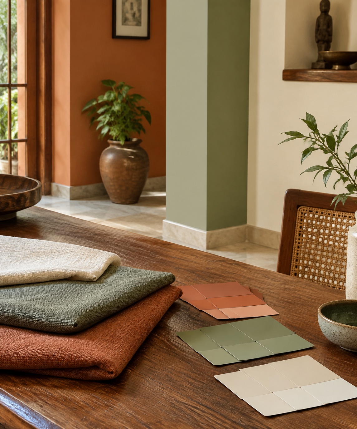
Colour & texture of materials
We choose colour by studying how each room is used, which direction it faces and how the family wants to feel in it — then test paint, stone, wood and fabric together under real light before anything is approved.
Where the idea comes from
- • The earth tones of Tamil Nadu — red laterite, temple sandstone, paddy-field greens.
- • Heirlooms and objects the family already loves: a silk saree, a brass lamp, a painting.
- • The direction of the room: north light reads cool, south and west light read warm.
How we turn it into design
- • A 60-30-10 balance of base, supporting and accent colours for each room.
- • Material samples — laminate, veneer, stone, paint — reviewed side by side at the site.
- • Matt and textured finishes in living areas to soften glare; washable finishes where children play.
Designed with empathy
How it serves your family.
Practical
Finishes chosen for upkeep, stain resistance and how they age in our climate.
Emotional
Calm tones for bedrooms, warm and lively tones where the family gathers.
Social
A cohesive palette across rooms, so the home feels considered to every guest.
From our projects: Our Saravanampatti villa used fluted walnut, backlit onyx and warm brass to give the living room a quiet richness.
FAQ
Questions homeowners ask
How do you choose colours for an Indian home?
We start from how each room is used and which way it faces, then build a palette from local materials and the family's own objects, and test it under the room's real daylight.
Which colours suit a hot climate like Coimbatore?
Light, warm neutrals with matt finishes reflect heat and reduce glare, while deeper accents are kept to textiles and feature walls.
Free design tools
Explore before you commit.
Find your style
A short questionnaire about your family and routines that suggests a design mood.
OpenPrice Estimator
Upload your floor plan and see a cost range in minutes.
OpenDesign Visualizer
Upload a room photo and preview it designed.
OpenKitchen Design Guide
Our free checklist for planning a kitchen that works.
OpenLet's begin with a conversation.
Book a discovery session — in our Coimbatore studio, at your site, or on video from anywhere in the world.